Why Your Training Software and Wearables Are Not a Mirror of Your Biology
The Data Addiction
We are all guilty of it. You upload a ride, APIs work overtime, and within minutes you are staring at the charts. One line that constantly catches my eye is “the blue line.” In Intervals.icu, it is called Chronic Training Load (CTL). In cycling jargon: your ‘Fitness’. Strava also displays this information (only in the paid version), as does TrainingPeaks.
If that line goes up, you feel like a champion. If it drops after a recovery week, panic strikes as if all your hard-earned gains vanished in one fell swoop.
But here is the hard truth: your software has absolutely no idea how fit you are.
It knows nothing about your mitochondria, your fat oxidation, your stroke volume, or your aerobic threshold. All it does is apply a single mathematical formula to the mechanical input of your power meter: your Training Stress Score (TSS). Nothing more.
The Blind Spot of the Formula: Not All TSS Is Created Equal
The Performance Management Chart (PMC) is based on the Banister model. That model is elegant in its simplicity, but physiologically, it is colorblind. The software calculates your TSS based on intensity and duration. And that is exactly where things go wrong.
A Paradoxical Example
| Ride | Content | Duration | TSS |
|---|---|---|---|
| Ride A | Monotonous, flat Zone 2 – steady, few peaks, pure aerobic stimulus | 4 hours | 180 |
| Ride B | Ultra-intensive interval training with microbursts, sprints, and blocks above the anaerobic threshold | 1.5 hours | 180 |
For TrainingPeaks and Intervals.icu, the impact on your fitness line is exactly the same: +180 TSS. But your body responds in completely different ways:
- Ride A builds your aerobic engine and fat metabolism with minimal strain on your nervous system.
- Ride B depletes your glycogen stores, disrupts your hormonal balance, and demands days of recovery.
The computer thinks in numbers. Your body thinks in physiological systems. A high CTL is worthless if your metabolic profile does not match your goals.
External Culprits: Heat and an Incorrect FTP
Your chart can be completely disconnected from reality for two other reasons:
🌡️ Heat and Cardiovascular Drift
When it is hot, your body has to send blood to the skin to cool down. Your heart rate shoots up at the exact same power output. If you use hrTSS (heart rate-based TSS), the software assumes you underwent a massive physiological stimulus, causing your CTL to explode. In reality, the mechanical load was lower—you were simply overheating and dehydrating.
⚙️ The FTP Lie
Your entire chart stands or falls with the accuracy of your FTP. If it is set just 15 watts too low, the software systematically overestimates every single workout. You end up building a beautiful, fictional fitness profile in the cloud—one that is nowhere to be found out on the road. An incorrect FTP is the fastest ticket to becoming a ‘paper champion’.
How to Actually Use the Chart Like a Pro
Should we just throw the charts in the trash? No, absolutely not. It is a fantastic tool—as long as you understand how the engine under the hood works.
To read the chart correctly, we have to take one step back to the foundation of the Banister model. This mathematical model divides your training sessions (TSS) into two physiological forces that are constantly fighting each other:
- The Positive Force (Fitness / CTL): Your long-term training load (the average of the past 42 days). This line rises slowly and drops slowly.
- The Negative Force (Fatigue / ATL - Acute Training Load): Your short-term load (the average of the past 7 days). This line shoots up like a rocket after a hard workout but drops quickly once you rest.
The sum of these two forces determines your Form (TSB - Training Stress Balance). The simple formula is:
Fitness (CTL) - Fatigue (ATL) = Form (TSB)
Once you understand this, you can utilize the chart with precision using three golden rules:
- Pace your progress via the Ramp Rate: Do you want to increase your Fitness (CTL)? Do it step-by-step. A healthy ramp rate (the weekly increase in your CTL points) lies between 5 and 7 points per week. If the blue line rises faster, you run a high risk of overtraining, injuries, or a physiological burnout.
- Use it for tapering, not for daily guidance: The chart is useless for deciding what you should train today, but it is perfect for checking if you are fresh for an event. Leading up to a priority race, you want to deliberately let your fatigue (ATL) drop by reducing your volume. This shoots your Form (TSB) into positive numbers. The sweet spot for race day is ideally between +10 and +25 TSB. This ensures your muscles are recovered, but your engine hasn’t gone to sleep.
- Data guides, but feel decides: Is your Form (TSB) mathematically perfect at +15 (super fresh), but your legs feel like lead when you wake up and you can’t get your heart rate up for the life of you? Trust your body, not the algorithm. The software does not account for a bad night’s sleep, work stress, or an oncoming cold. The algorithm does not ride the bike.
Conclusion
By all means, keep analyzing those charts, because visualizing consistency is highly motivating. But use them for what they were intended for: as a long-term compass, not the obsession of the day.
This issue is not limited to CTL. It is the fundamental flaw of every modern sports gadget. Just look at the well-known VO2max estimation or the Training Status on your Garmin watch.
Had a stressful week at work, slept poorly, had a bit more alcohol, or trained in the heat? Your heart rate shoots up, your Garmin ‘VO2max’ drops two points, and your watch immediately screams that you are “detraining” or that your training is “unproductive.”
Did you actually lose all your fitness in one single blow? Of course not. The algorithm simply looks at the mathematical ratio between your speed/power and your heart rate on that specific day. It knows nothing about your mental stress, ambient temperature, or the fact that your body is adapting physiologically behind the scenes.
The Flawed Focus on the Short Term
The moment we strap on a wearable, we become database managers of our own bodies. We want a perfect recovery score every morning, and we want every chart to climb daily in a perfectly straight line. But biology does not work linearly. Real physiological progression—like building new mitochondria or strengthening your heart muscle—is a slow process that takes months and years.
If you blindly follow the daily or weekly fluctuations of a computer model, you will inevitably panic during the first recovery week when your fitness line (CTL) drops. You start making decisions based on incomplete data instead of the reality inside your muscles.
The Pro Approach
Ignore the short-term noise. Use the software to guide long-term patterns:
- Is your power output increasing at the same heart rate over a three-month period? Then you are fitter.
- Does your HRV (Heart Rate Variability) remain stable within your healthy baseline across an entire training block? Then you are absorbing the training load well. Unlike a CTL calculation, your HRV trend looks directly at the status of your autonomic nervous system and reflects actual biological stress.
Remember: no medals are handed out at the finish line for having the highest CTL on Intervals.icu or for a fictional VO2max score on your watch. Prizes are won on the asphalt—and out there, the only thing that matters is what is actually in the legs.
Case Study: Why My Fitness Is Dropping, While I Am Producing More Power Than Ever
Let me make this concrete with my own data from the past 12 weeks. I am currently in the middle of a heavy block full of VO2max intervals and aerobic threshold training. I feel fitter than ever: recovery is incredibly fast, my legs feel sharp, and heavy intervals feel much smoother than at the start of the program.
Yet, when I open my Performance Management Chart, I notice something strange. My blue ‘Fitness’ line (CTL) is stagnating (and even dropping slightly). It refuses to go up and is stuck around 62. If I blindly trusted the software, I would be panicking right now, logging extra hours just to save that line.
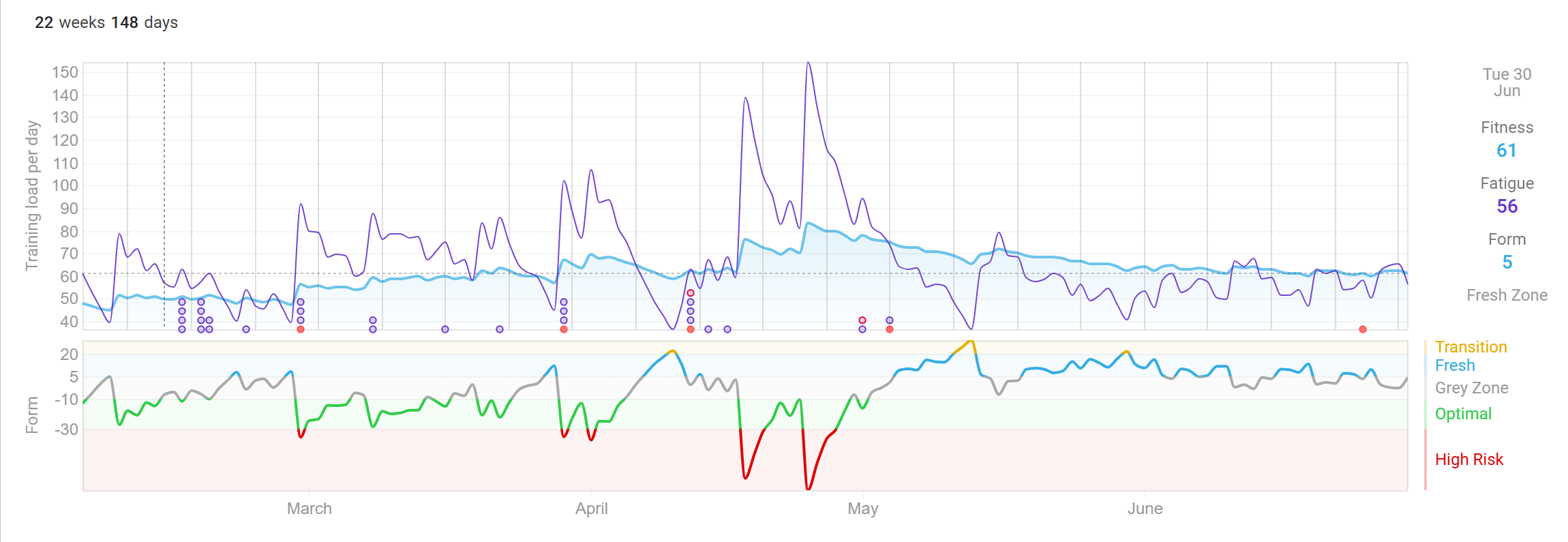
Why does the PMC fail here?
Because the focus of my current training block has shifted toward intensity instead of pure volume. A shorter, ultra-intensive workout stimulates entirely different energy systems. However, because the total number of weekly training hours (and consequently the total weekly TSS accumulation) is lower than during a pure base/volume block, the algorithm registers less quantity. The algorithm sees less TSS, so it concludes that fitness is dropping. CTL is, after all, a volume parameter.
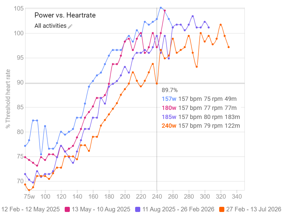
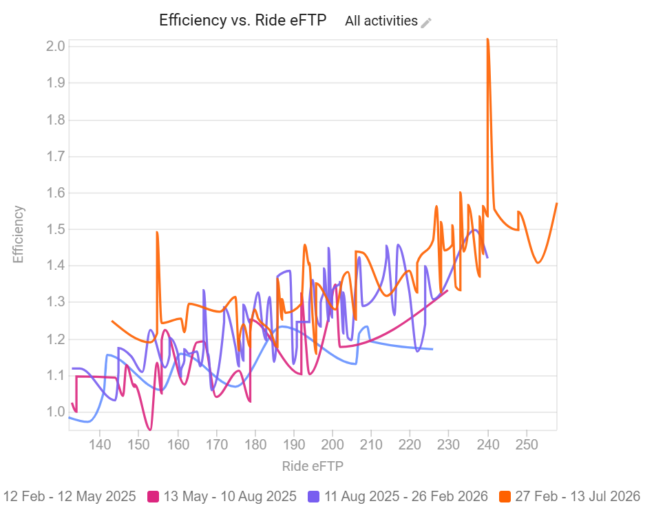
Fortunately, physiological efficiency charts (such as the Efficiency Factor or EF, which measures the ratio between mechanical power and heart rate) tell the real story.
The Numbers Don’t Lie
In February, at 89.7% of my threshold heart rate, I was riding at 185 watts. Today, at the exact same heart rate, I am producing: 240 watts. That is an improvement of 55 watts — at the exact same heart rate.
And when we look at metabolic efficiency, the picture becomes even clearer. The better that ratio, the more mechanical power (watts) I deliver per heartbeat registered by my computer.
The Conclusion of My Own Data
| What the PMC Sees | What My Body Is Doing |
|---|---|
| CTL remains flat or drops slightly | I am delivering 55 more watts at the exact same heart rate |
| Software says: “No progress” | My engine is running more efficiently than ever |
| The chart measures quantity (amount of TSS) | Efficiency metrics measure quality |
My mathematical fitness decreased. My biological engine became a finely tuned machine. And that is exactly why you can never blindly rely on a single number.
🔥 What I Want You to Remember:
- Algorithms measure quantity, your body responds to quality: Whether it’s the blue CTL line in your software or the VO2max score on your watch: a computer model counts numbers. Your body listens to physiological systems. A shorter, targeted interval session scores fewer ‘mathematical fitness points’, but it can give your biological engine a massive boost.
- Let go of the day-to-day/week-to-week obsession: Fluctuations in your daily recovery scores or a weekly dip in your fitness chart are database noise. Biological adaptation—such as building mitochondria and developing a more efficient heart—is a slow process that takes months. Steer your training based on the long-term trend, not the daily score.
- Use performance indicators, not cloud data: Are you getting faster at your threshold? Are you pushing more watts at the same heart rate? Is your HRV baseline holding rock-solid within your healthy comfort zone? That is the undeniable proof that you are getting fitter. No software index can compete with that biological reality.
- Data guides, but your biology decides: Software and wearables are fantastic tools for spotting patterns, but they don’t ride the bike. If the cloud says you are in peak shape, but your legs feel like lead: trust your body, never the algorithm.